Ginger Singh Kauldhar
Tomlinson's Successful SME Rebrand
At the end of 2019, Tomlinson Ltd, a long-established and leading UK die-maker, unveiled its new company branding which has subsequently received some fantastic praise and positive feedback. A rebrand is a huge undertaking for any SME and involves a great deal of commitment, determination, time, energy and financial investment.
So, why rebrand?
Tomlinson’s decision to overhaul its company branding came about as a result of a major change within the business, specifically the retirement of Managing Director, Lynne Tomlinson-Hands, who had been at the company’s helm for many years.
Lynne’s departure subsequently led to the appointment of three new directors: Ginger Singh-Kauldhar (Business Development Director); Jon Colburt (Production Director); and Jim Littler (Finance Director) - all loyal and long-serving senior members of staff eager to drive the company forward.
This change of directorship signaled the ideal time to update the company’s brand image in order to convey a new, fresh and contemporary visual identity representative of the internal transformation the company had undergone.
With over 90 years of successful trading, Tomlinson’s new directors were mindful of steering the company into the future, whilst not turning their backs on a prosperous past of which they remain extremely proud. Thus, the decision to rebrand came with great responsibility.
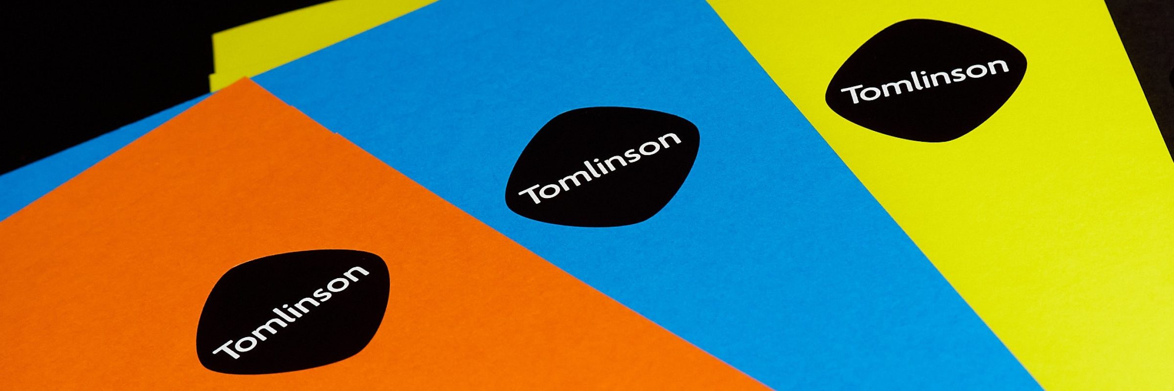
Logo
“Changing our branding, especially the logo, wasn’t an easy decision to make,” says Ginger, “not only because our industry-recognised ’Tomlinson T’ had defined our company identity for so many years, but also because, as we later came to realise, we’d become quite emotionally attached to it!”.
While Tomlinson has a number of skilled and brilliantly creative staff in their team, the company looked to professional branding agency, Sunny Thinking for expert help and guidance through the entire process. Gaining a fresh and objective viewpoint became an essential factor once a sentimental attachment to the existing logo had come to light.
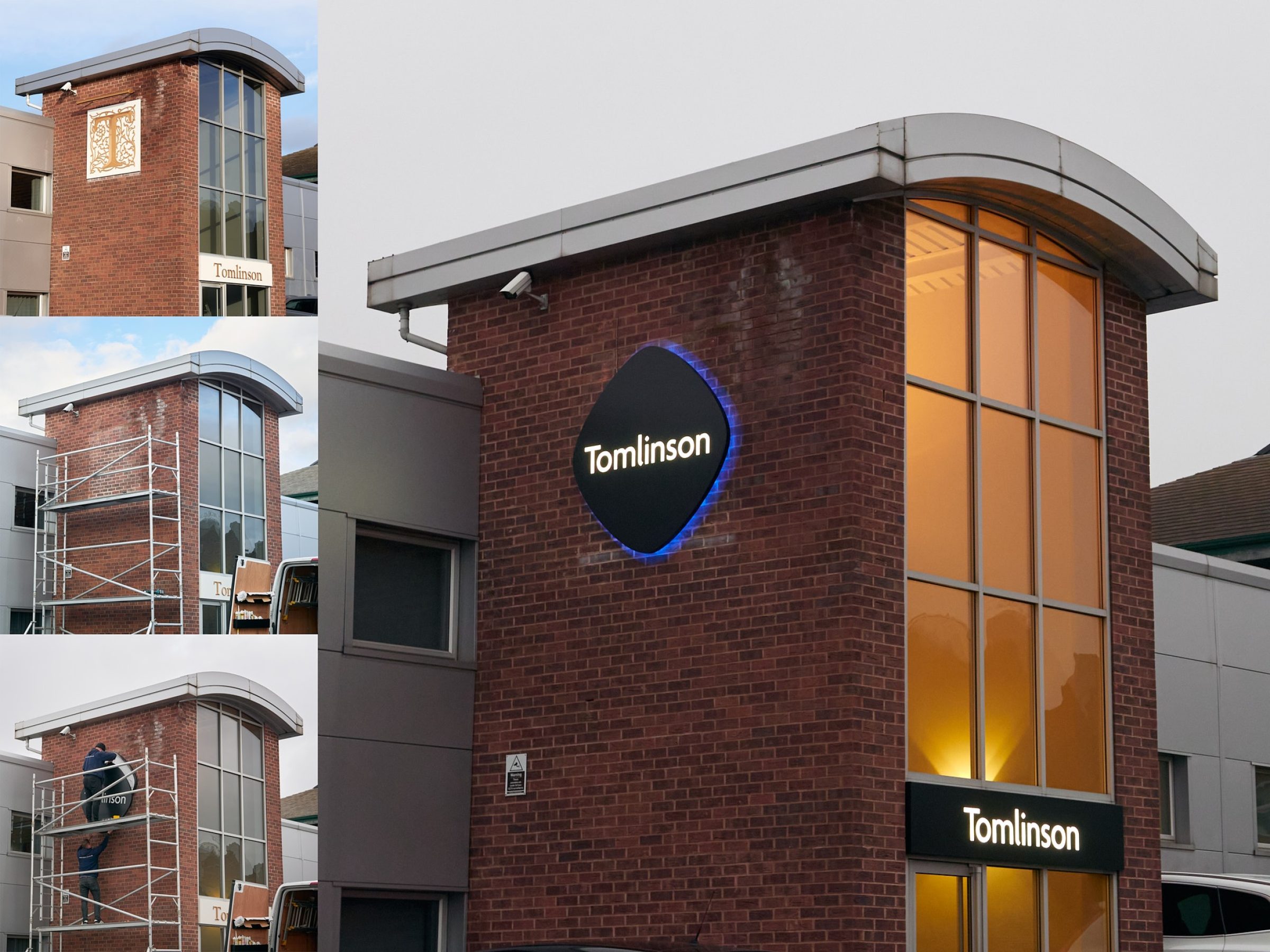
What followed was the task of exploring and considering numerous possibilities and options until a new Tomlinson logo was unanimously approved, marking what was to be just the start of an intense and exciting journey.
As the foundation of every business’ brand, a company’s logo serves to communicate who they are, how they approach their business activities and what they offer to their customers. “Our new logo is contemporary, straight-forward and fuss-free,” states Ginger, “we all love it and feel that it represents the straight-forward, fuss-free service that we offer.”
Learn more about Tomlinson’s rebranding journey by subscribing below. Or why not get social and connect with Tomlinson on Linked-In, Instagram and Twitter?