
Ginger Singh-Kauldhar
Unifying New Identity! Corporate Stationery and Signage
For too many years the word ‘foil’ was rarely spoken without the trusty prefix, ‘gold’. But leading UK foiling and embossing die-maker, Tomlinson Ltd, have put an end to this conventional and long-established partnership. And not a moment too soon!
This came about as the result of Tomlinson’s corporate identity overhaul which involved taking a very close and self-analytical look at their existing corporate image. The journey began with redesigning the company’s logo which, true-to-form, was ‘gold-foil’ and now served only to reinforce the outdated partnership. So they broke it up. And now black is the new gold.


Brochure:
Dies. Whilst they may look like ‘lumps of metal’ to the untrained eye, each foiling and embossing die is bespoke and unique. The array of dazzling visual effects these weighty metal blocks can produce simply has to be seen to be believed, appreciated and understood.
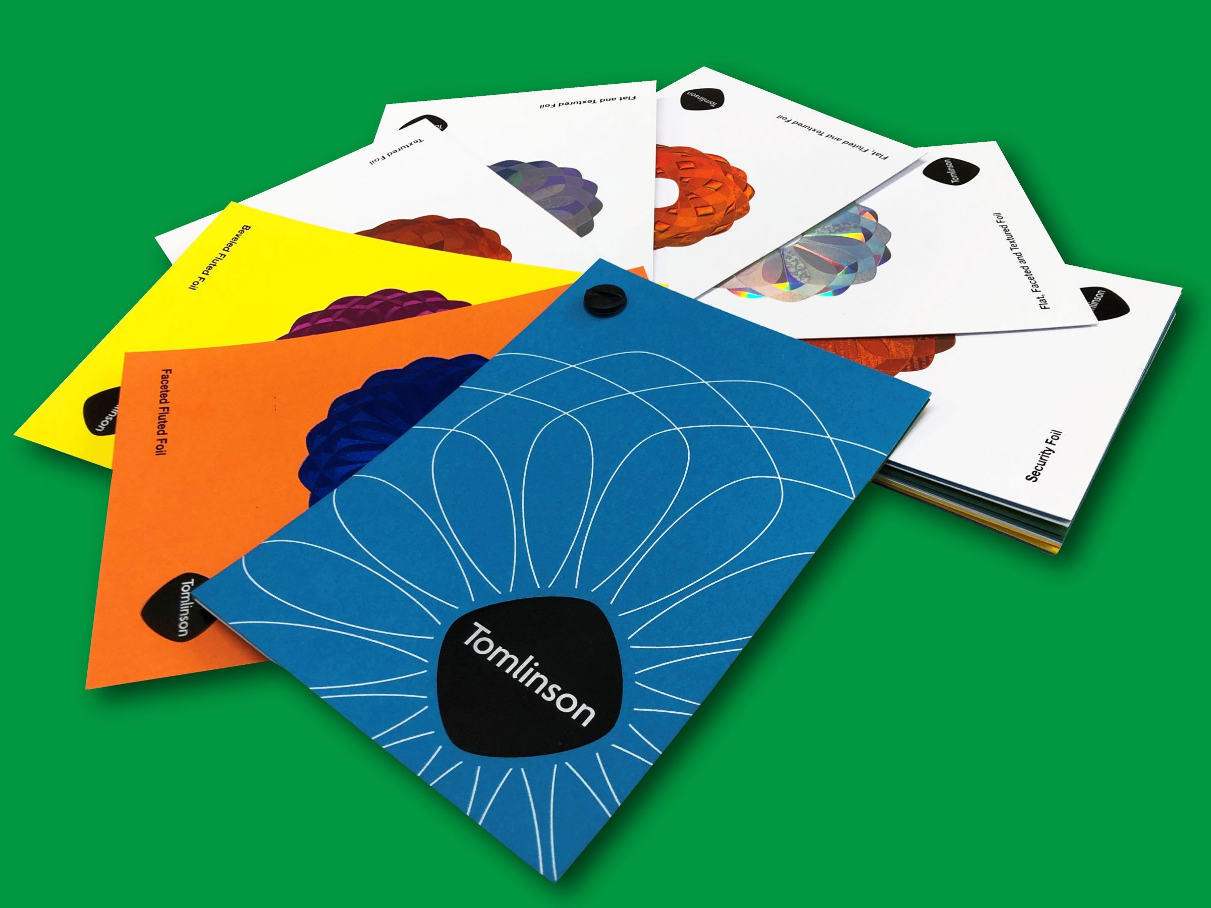
Our brochure is a stunning, comprehensive, colourful and educational library of eye-catching print-finishing effects which demonstrates the plethora of impressive finishes and tactile textures that Tomlinson's high-end dies can produce. The use of the full spectrum of foil colours available leaves ‘the gold-foil partnership’ languishing in the shadows. Instead our brochure conveys the abundance of choice and possibilities. A must-have for all designers, Tomlinson’s brochure is an inspirational guide for those in creative roles within the design and print industry who wish to build something new, distinctive and clever into their latest designs.
To get your brochure contact us or call us on +44 116 270 6244 today.
Business Card:
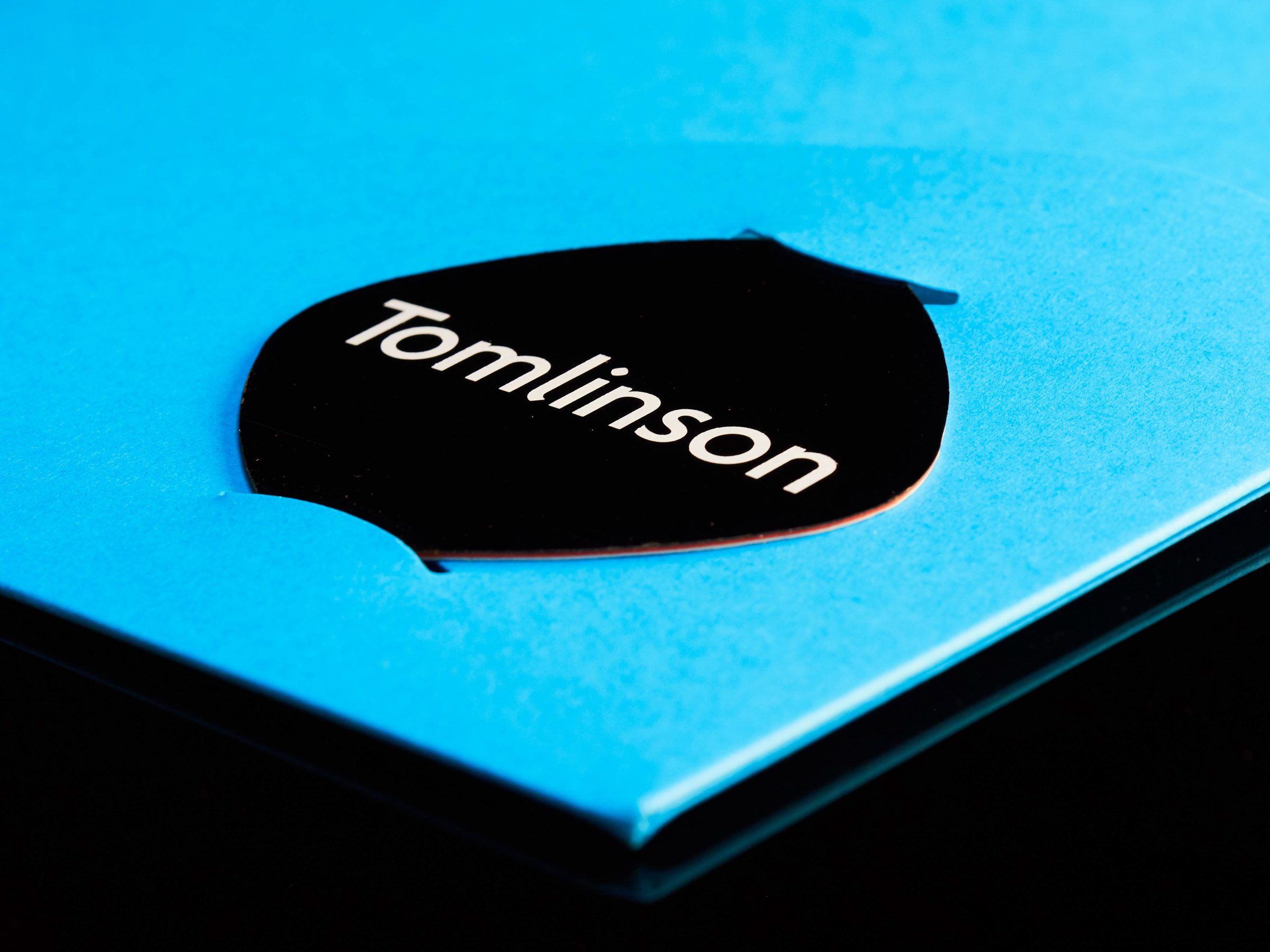
Rectangular, right? But wait, business cards don’t have to be. On seeing Tomlinson’s contemporary new logo for the first time, industry-colleague, Simon of A14 Print Finishing, instantly recognised that creating further rectangular business cards would be, frankly, a bit square. He suggested the idea of die-cutting the new ones to the appealing, rounded shape of the logo itself. Always open to new and imaginative ideas, that’s exactly what Tomlinson did.
In the hand this new and curvaceous business card feels very different: it’s tactile, stylish, modern, memorable and unusual. The use of sleek-looking black gloss flat foil with white over-foil is visually striking as well as smooth to the touch. No recipient could easily forget it. And with no sharp corners to dog-ear in the hand or pocket, it’ll stay looking stylish, too.
Corporate stationery:
For too long corporate stationery, on-the-whole, has displayed a somewhat conservative and unassuming identity. Formerly, Tomlinson’s did, too.
Tomlinson employee, Kasim changed all that. Known for his love of colourful clothing, Kasim served as the inspiration for bringing colour to the fore. Business Development Director, Ginger Singh-Kauldhar, explains, “I usually only wear dark blue, black or grey clothing to work, whereas Kasim rolls up in really bright colours! His colourful style is always a talking point and it made me think that we should follow his lead and ditch convention.”
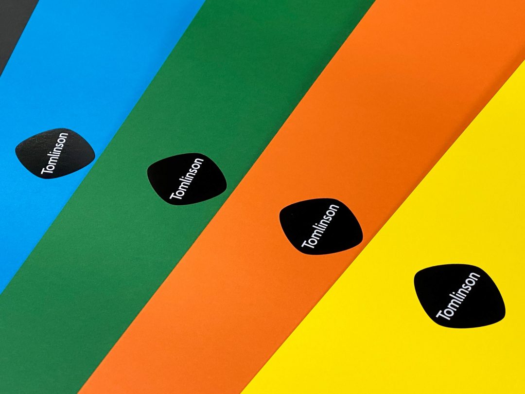
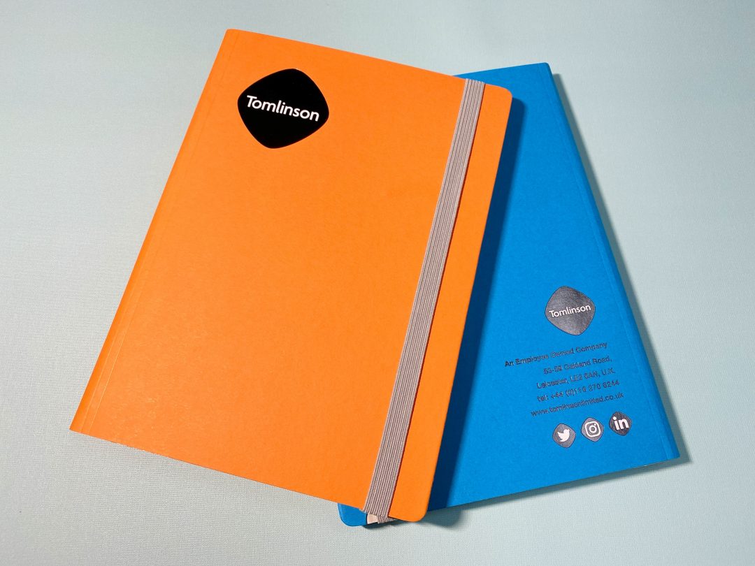
Ginger continues, “Our logo may now be predominantly black but set against a bright orange, yellow or green background it stands out like never before. It’s unmistakable and people will know instantly when a brochure from Tomlinson has arrived.”.
Interior Decorating & External Signage:
This use of colour has been tastefully extended into the Tomlinson premises where visitors are now greeted by eye-catching display-boxes showcasing impressive samples of their recent work.
In addition, investment in sparkling new internal and external signage ties the whole new corporate identity together resulting in an impactful, contemporary and coherent company image to take Tomlinson into the future.


“Rebranding has been and intense but brilliant process,” says Ginger enthusiastically, “and our entire workforce got completely behind it. Tomlinson boasts a highly skilled and creative team and our new company image conveys exactly who we are to the world. We couldn’t be more delighted!”.
Read more about Tomlinson's rebranding journey by visiting our blog and stay in-the-loop by subscribing (below) to the newsletter.
Or why not get social and connect with Tomlinson on Linked-In, Instagram and Twitter